turn-based rpg strategy Free-to-play mobile game
What do you do with an award-winning Marvel Facebook game? Port it over to mobile, of course! Marvel: Avengers Alliance was a popular game with strong roots and branding, featuring all of the most known heroes including Iron Man, The Hulk, Captain America, and Black Widow. At the game’s peak, mobile gaming was still in its infancy. Facebook games were king, making them the primary platform for social gaming. Let’s take a look at the design process to port over a Flash Facebook game to mobile device.
At the time, I had been interning for Disney Interactive for several months. After graduating from my Master’s program, I was immediately promoted to a full-time position. Thus, my adventure on this project began.
facebook game Porting to mobile (Ios & android)
Tools
Illustrator
Photoshop
Roles
Julie Mok UI/UX Designer
Jessica Yun UI/UX Designer
Timeline
One Year
PROBLEM
Marvel: Avengers Alliance was a Facebook Games hit at it’s peak. To expand their audience and revenue potential, Disney Interactive turned to mobile devices in hopes of inviting another large audience to this hot game. This was during 2012, when games like Angry Birds, Jetpack Joyride, and Tiny Towers owned the mobile gaming market. This wasn’t our studio’s first port to mobile (anyone remember Gardens of Time?) but it was definitely the most extensive game to port so far. Without many competitors on the market of similar genre, how do we know what good looks like? How do we achieve success on a different platform?
Since the beginning of the project, we knew we wanted to update the UI and UX of the game to fit mobile. Resizing each piece to fit in mobile resolution from Facebook assets wasn’t going to cut it. Additionally, it was a story-driven game with lots of text tucked away in various menus and mouseovers, equivalent to a tap-and-hold function we considered too cumbersome for players on mobile.
“How can we translate the Marvel game and branding so the experience is cohesive and successful on mobile?”
GOALS
Expected scope
There are a few key goals we had for this port:
Keep the game’s look and feel
Update the UI and UX to optimize mobile gameplay
Complete the port quickly
Actual Scope
As the project went on over time, the scope of it expanded larger and larger. On top of the previous goals we expected to reach, these problems also arised:
Many of the Facebook version’s art assets could not support resolutions on mobile
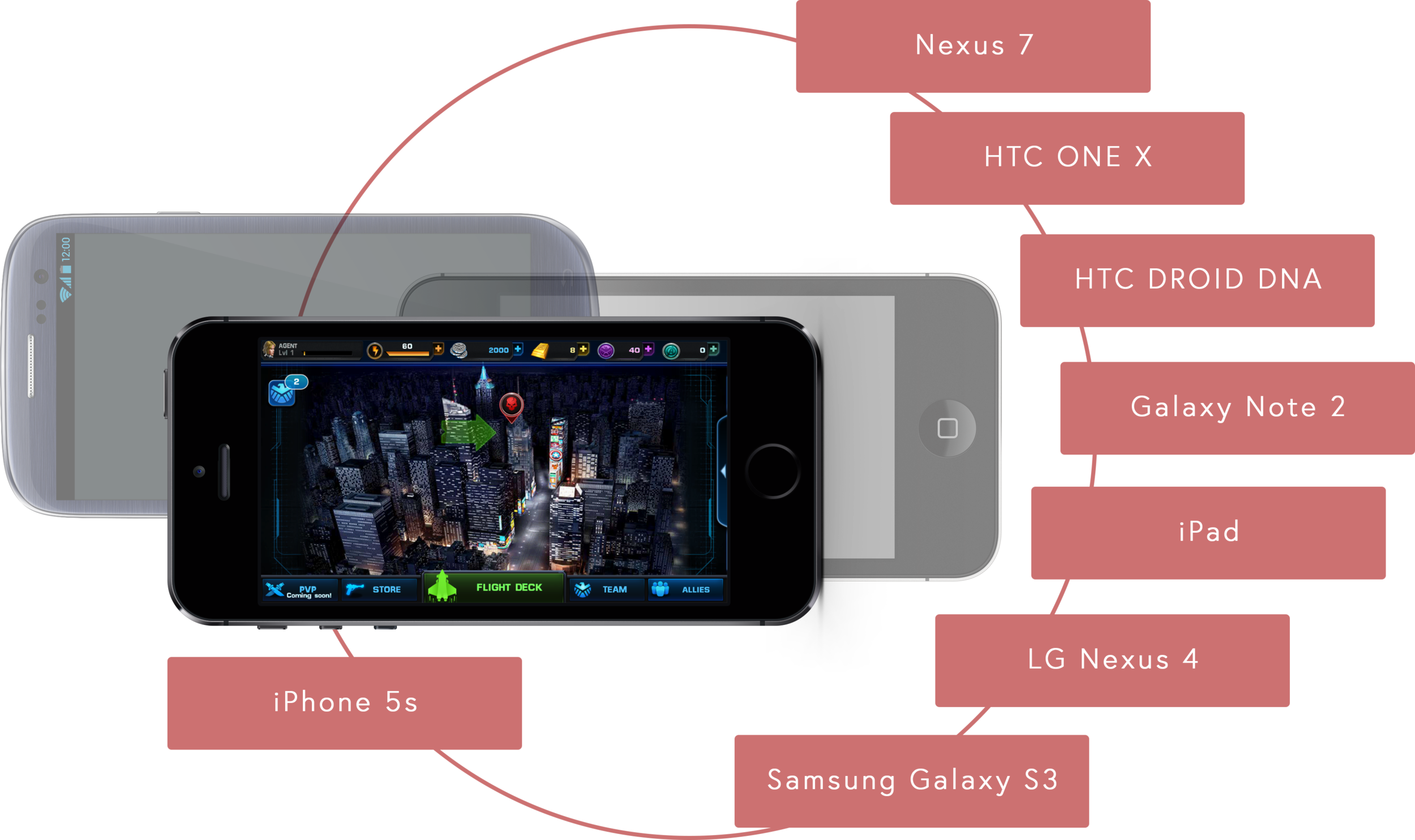
The port was expected to work on various mobile devices, including tablets- this is before the magical time of dynamic interfaces!
Late in our development cycle, Apple unexpectedly announced the iPhone 5 and the Retina display-enabled iPad 3
RESEARCH
Without many other games in the same genre in the mobile market, we had a hard time drawing references from other games. However, we believed Marvel: Avengers Alliance is a uniquely advanced game with a strong IP that will fill a hole that is desired in the market. The team drew assumptions with the data points from the Facebook version and created personas:
Personas
We created several personas, keeping in mind players that will be familiar with the Marvel franchise and those that convert over from the Facebook version of the game. Understanding the needs of each persona will help the game develop in the right direction:
Carl, the casual player:
- Plays the game at their own pace
- Wants to see familiar characters from the IP he likes
- Typically won’t spend money on mobile games
Jenna, the Facebook player:
- Is already engaged with the game and is converted to the mobile version
- Familiar with the game already and can easily play through the content
- Not looking to spending money again the second time since she has already spent on the Facebook version
Sam, the Engaged player:
- Brand new to the Marvel IP but likes the gameplay a lot
- Will spend money on games when there's a sale
- Not interested in playing Facebook games
Evan, the hardcore player:
- Driven by IP to keep looking forward to new content updates
- Gamer familiar with turn-based strategy RPGs
- Like Jenna, is converted from the Facebook version to play the game even when he's away from his computer
- Makes purchases regularly to stay on top of Leaderboards
SOLUTIONS
Working with the unexpected
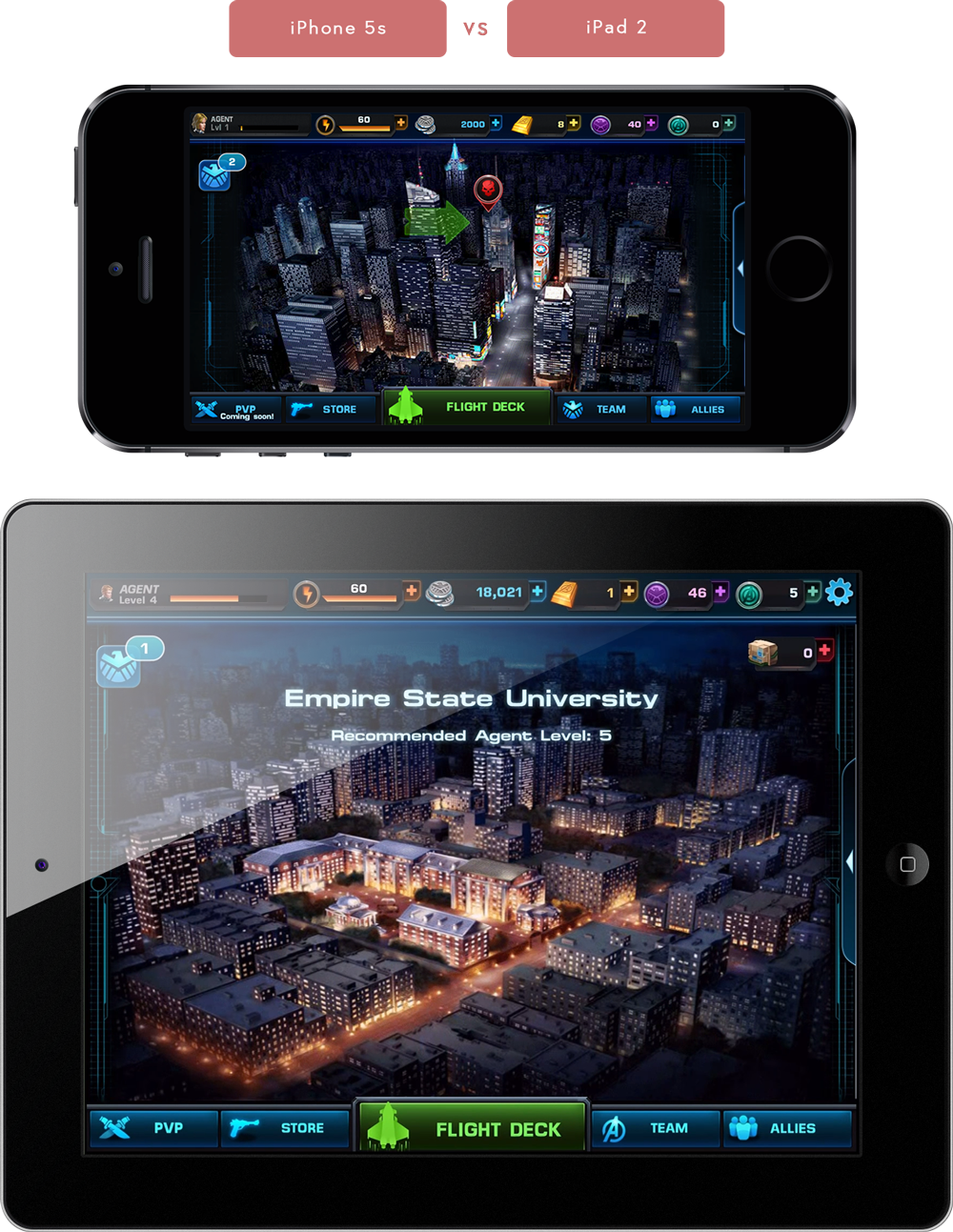
We wanted to make sure Marvel: Avengers Alliance would be successful and future-proof. As mentioned before, the scope of the project expanded unexpectedly because of the number of different phone resolutions we wanted to tackle. In order to do so, we spent many weeks re-creating the assets so they are vector-based to avoid falling into the same pitfall of improving resolutions again. Since the technology we had at the time did not support dynamic interfaces, we also made different mock-ups along with art assets per resolution so the game would look perfect on any device.
mobile optimization
In addition to making the game look ideal on any device, we also spent time to improve the User Interface for a better mobile experience.
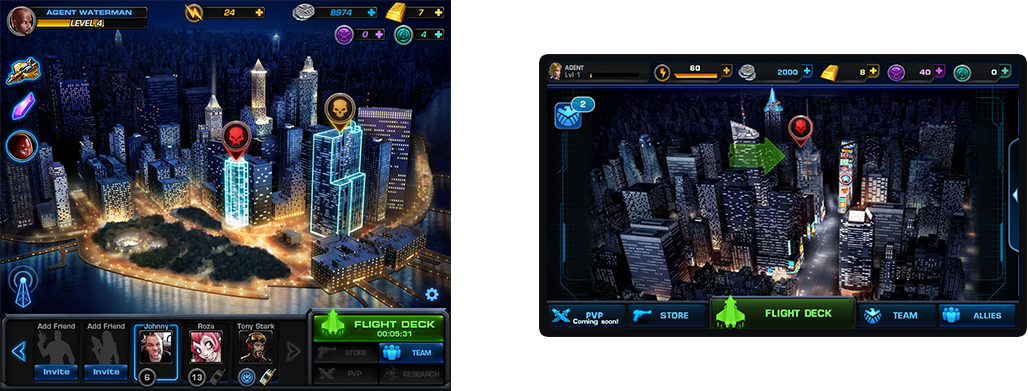
In the Facebook version, it was very popular to interact with your friends to send gifts and remind them to play daily. In the mobile version, we did not have the same feature pushed the the front. Instead, we decided to make the top and bottom HUD spread further apart so that it would take up less vertical space. All the currencies were able to fit against the top while all the buttons that were previously on the lower right are now prominiently displayed across the bottom of the screen in the mobile version.
Combat was especially important because it is the main feature of the game. It's used in the story, events, and PvP. Combat is where the player gets the most action and also where emotion is built. I really wanted to improve this experience in particular for mobile.
We had two key findings from researching for mobile optimization:
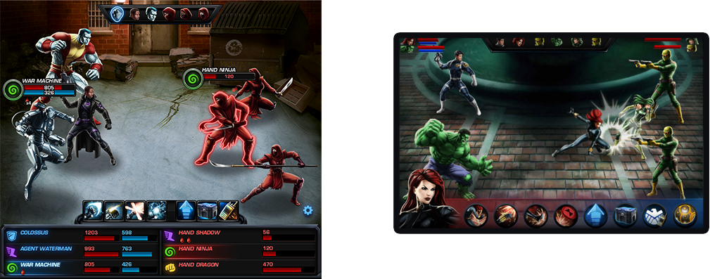
1. Needs Larger ButtonsIn the previous example, we taught the player the bottom area is the prime call-to-action location. This time, we made large circular buttons to line up along the bottom of the screen to continue this expected experience. To minimize clutter in the main battlefield, I also relocated the red and blue bars of information on each character to the top left and right corners of the screen where the player won't be covering it with their hands at the bottom and the information is readily available for them to review. The names of the characters were replaced by their portraits so the player would have an easier time referencing the relative information.
2. Avoid Too Much Text
Feedback
Just a few months before the launch of our game, we had our grand finale review meeting with Marvel. Everyone on the team was very excited, this was a big project for our studio. Marvel gave us some minor feedback but the general response was positive. However, there was one major issue we had to address:
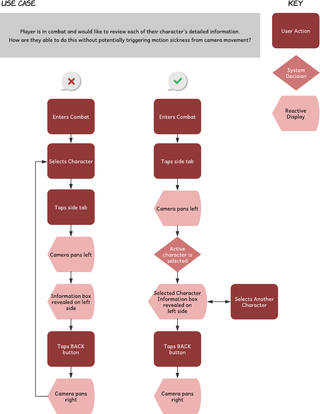
In attempt to relieve the mouse-over information from the Facebook version (left), I had hidden away the dense information behind the characters on the mobile version (right). The box of information was expandable where the player can continue to read more about the character as they scrolled down. However, when viewing the character details, the camera would shift to offset the character in order to display the information along the side.
"When players are comparing the information of each character, the camera would constantly move back and forth, creating a wave of motion sickness in some of our testers."
In response, we updated the flow of this use case so the cause for motion sickness would be minimized. By removing the need to exit the detailed information when examining multiple characters, the camera would move far less often.
takeaways
Looking back now, there are a lot of teachings I learned from Marvel: Avengers Alliance as my first full-time project!
Use data to help improve your product, especially when being an early adopter. There’s not many references or similar games to draw ideas from so it’s extra important to pay attention to every decision that is made. Not only do I want the game to be successful, I want to pave the road for similar games in the future. In retrospect, it would have been beneficial to gather data through analytics for how players played the game to help inform potential improvements for a better experience.
Need to test early and often! While the game turned out rather successful, a lot of improvements could have been made through user testing. Iteration is key to a game that is properly catered to your players! Potential improvements could have been made: Show the weaknesses of each character in combat so the player can make smarter choices each turn. Or, put all the different status effects into a menu to be referenced as a whole, rather than on a per-character basis. Actually, this is one thing I added to a future project at NCSOFT.
Test your game using a variety of methods. It sounds like a hassle to get a testing group together but the results are always helpful! We cannot consistently just rely on internal testing and machine testing for the entire product. Such as the motion sickness problem we had late in development, that behavior cannot be tested by machines and can be a serious hazard for the player. As developers, we can become accustomed to the flaws of the game and easily ignore them during internal testing so it’s good to get external sources with fresh eyes.


